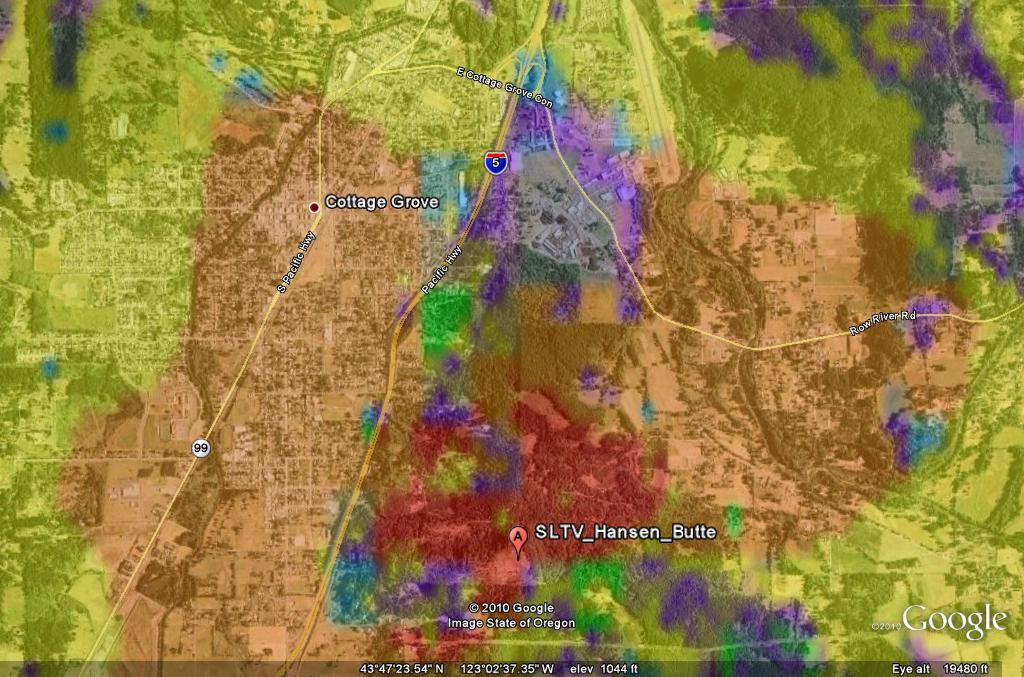
Longley Rice
field strength plots with a Google Earth overlay
These
computer runs generated a .kml (keyhole markup language) file and an
associated graphics file which I have converted to .png (portable
network graphics) format. Together these files will produce a Google
Earth overlay which indicates predicted field strength by displaying
six colors representing field strength as follows:
Red: 100 dbu
(microvolts per meter) or more; Probably receivable with an indoor
antenna.
Orange: 90-100 dbu; Possibly receivable with an
indoor antenna.
Yellow: 80-90 dbu; Attic or outside antenna may be
required.
Green: 70-80 dbu; Probably receivable with an
outside antenna.
Blue: 60-70 dbu; Outside antenna
required.
Purple: 50-60 dbu; Extra effort may be required
for reliable reception.
The
computer runs used the Longley Rice terrain dependent model for
predicting field strength taking into account the transmitter
location, height above ground, effective radiated power, and
transmitting antenna pattern. The receiving antenna height was set to
10 feet above ground. The colors represent a statistical probability of
a given field strength at 50 percent of locations 90 percent of the
time. The terrain data used was the 1 arc second SRTM-1 (Shuttle
Radar Terrain Mapping) database generated by space shuttle
overflights.
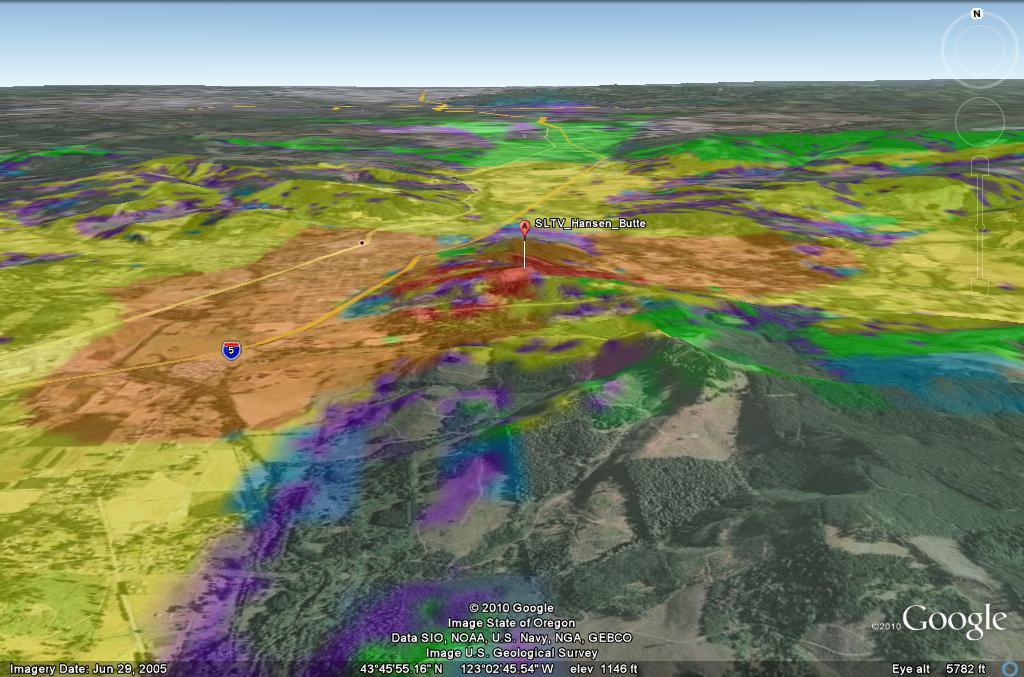
With
the Google Earth program and overlay you can "fly around" and see what
the field strength is predicted to be at a given location. You can type
an
address into Google Earth and the program will zoom in to show the
field strength at that location. You can "tilt" the landscape for a
surprisingly realistic computer generated view of hills
that may be blocking reception in an area.
Sample Image (looking
straight down)
Sample Image (landscape
tilted)
Instructions For Viewing
the Maps
Download and install Google Earth if you have not already done so.
Download the .kml and .png files for the transmitters of interest.
Start
up Google Earth, go to File/Open, and open the .kml file for a
transmitter of interest. You will see
a large "X" over the coverage area indicating something is missing.
In
the "Places" pane to the left of the Google Earth window there should
be an entry under "Temporary Places" with the name "SPLAT! HD" and
showing the name of the transmitter coverage overlay.
Click on the + sign to the left of that entry then right click on
"SPLAT! Signal Strength Overlay".
Click
on "Properties" and near the top of the properties window you should
see a "Link" box displaying a file name with a .ppm extension.
Click on the "Browse" button to the right and select the .png file
associated with the transmitter of interest.
The
overlay colors should now display but for best viewing you need to move
the "Transparency" slider to somewhat less than halfway between "Clear"
and "Opaque". This reduces the color intensity of the overlay allowing
the Google Earth satellite image
to show through.When
satisfied with the "Transparency" setting click "OK" at the bottom of
the window.
About he overlay
images
I
have reduced the .png images from 7200 X 7200 to 2048 X 2048 pixels to
make the files smaller (still around 3 MB). This reduces the accuracy
somewhat when you zoom in close. I can post the high res file for a
given site if anyone wants it (up to 24 MB). Also I can make computer
runs for other sites if anyone wants them. Email me at dan at ridgelinebroadcast.com
SLTV_Hansen.kml
SLTV_Hansen.png
SLTV
Hawley.kml
SLTV
Hawley.png
SLTV
London.kml SLTV
London.png
WLTV
Florence.kml WLTV
Florence.png
TIA
Ukiah.kml
TIA
Ukiah.png
Powers.kml Powers.png
BlackButte.kml BlackButte.png